
How to Create a Treemap Chart Visualization in Reveal
A Treemap Chart is designed for drill-down scenarios. It shows the relative weight of data points at more than one level allowing users to continuously drill down deeper into the data set that is represented by smaller rectangles for more efficient analysis.
A Treemap Chart is a data visualization that shows hierarchical data using nested nodes (rectangles) of varying sizes and colors, making it easy to spot data patterns or compare data quantities.
While a Treemap is sometimes categorized as a “distribution” visualization, I see it mostly referred to as a “part-to-whole” visualization, showing categories (parts) of a data set that add up to a total (whole) value.
Categories are shown in proportion to other categories based on their value percentage to the total value being analyzed.
Unlike the arguably most popular part-to-whole visualization, the Pie Chart, a Treemap Chart is designed for drill-down scenarios. It shows the relative weight of data points at more than one level (represented as a rectangle) letting you continuously drill down deeper into the data set that is represented by smaller rectangles for more efficient analysis.
At the same time, Treemaps are not designed to convey numerical quantities; the intent is to show relative ranking and relative differences in data-set values.
Squarified Treemap
Originally designed to visualize files on a hard drive, Treemaps have been applied to a wide variety of domains ranging from financial analysis to sports reporting (Ordered Treemap Layouts, Ben Shneiderman, Martin Wattenberg, http://www.cs.umd.edu/hcil/treemap-history/). To represent data in a Treemap structure, there are several algorithms to choose from, like Squarified, Slice and Dice, and Stripped, with the most common being the Squarified Treemap algorithm. Reveal uses the Squarified Treemap algorithm, which works well across all screen sizes (desktop, web, mobile) and devices with a low aspect ratio.
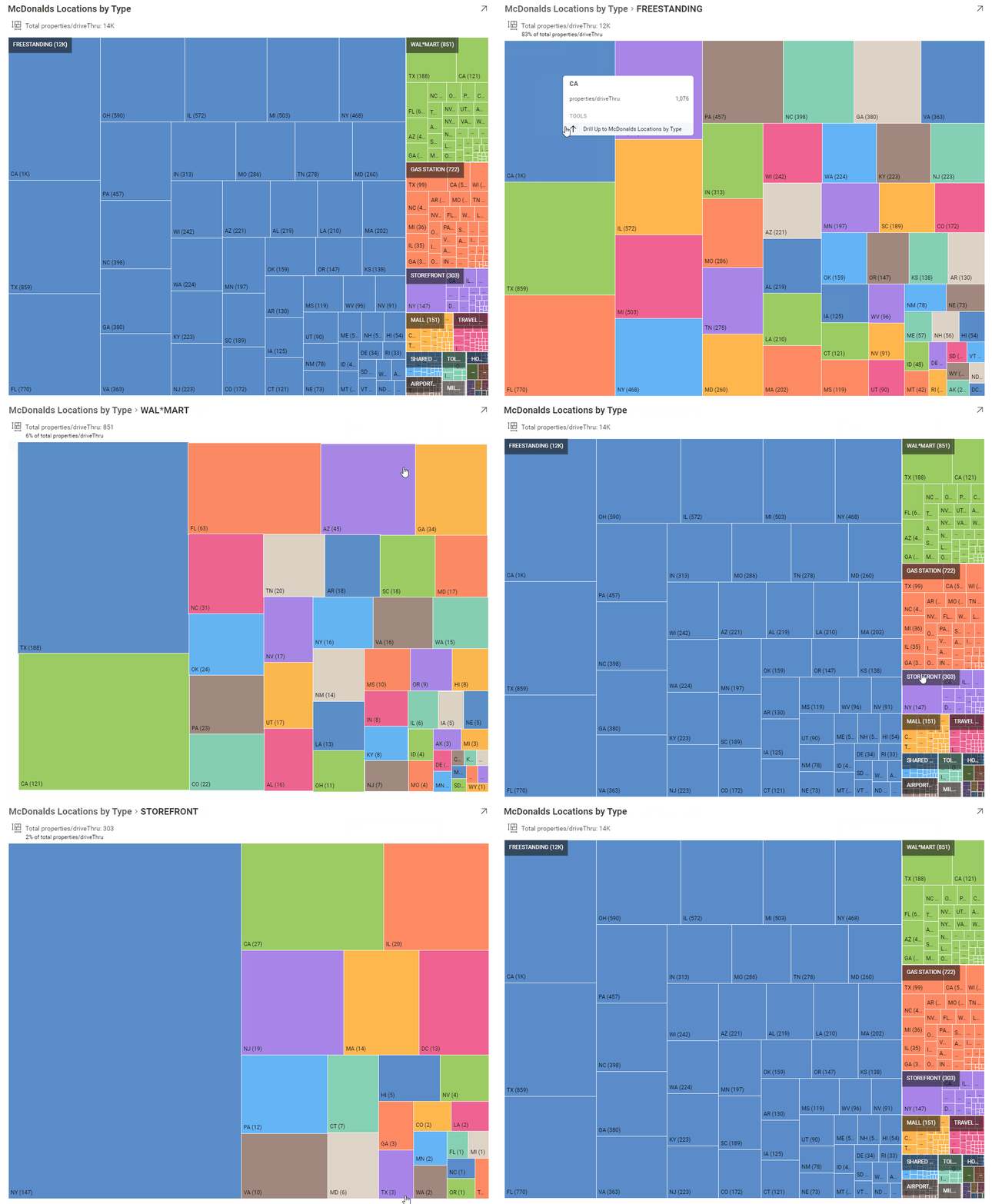
Here is an example of a Squarified Treemap in Reveal, showing McDonald’s stores by type.

In this example, the Treemap is showing a breakdown of the number (count) of McDonalds store types (Freestanding, Gas Station, Mall, etc) by State. With Reveal embedded analytics, you can get further information in the tooltip for each category, like Count by State, and you can drilldown into each Treemap Category (the State Name) to get a quick-glance analysis of the state level summaries. The number of drilldowns is only limited by your data, for example, if we added an additional Treemap hierarchy for City, or County, we could do further analysis and drilldown.
Best Practices for Using a Treemap Chart Visualization
Like any other data visualization, a Treemap chart visualization should be used in specific scenarios. It does not solve the same problem that a visualization like a Bar Chart or a Line Chart would. It is really meant for a more complex, richer data display.
When to use a Treemap Chart
- Drill-down hierarchical data (data organized as a tree, with branches and sub-branches)
- Illustrate hierarchies of relative weight and comparative values between categories (branches) and subcategories (sub-branches)
- Display large data sets that need a compact, space-efficient visualization
- When you want to deliver at-a-glance, quick data analysis without precise values. The relative size of the rectangles help identify patterns and/or outliers very quickly
- To make efficient use of space. Treemaps can legibly display thousands of items on the screen simultaneously
When not to use a Treemap Chart
- If you are telling a data story that requires precise values
- If you have negative data values
- If you have flat, non-hierarchical data (though it’s still OK to use a Treemap with no drill-down, it may not be the best data visualization to use for your data story
- If your data is similar in size – in other words – if the user will see rectangles of the same size – it is counter to the Treemap best practices listed above
Examples of Data used with a Treemap Visualization
Treemaps are best used for larger data sets, with a highly varying quantitative value that need to be displayed in a compact, space efficient manner. Data scenarios for a Treemap can include:
- Election results by County or the number of votes by Party by County
- Product sales by Category, Sub-Category by Country
- Market shares of products by Technology / Regions / etc
- Product Category Exports by Country
- Sales by Division by Product
Using the Treemap Chart in Reveal
To learn more about the Reveal Treemap Chart, try these great resources:
- Video – Creating a Treemap Visualization
- Docs – Using the Reveal Treemap
To get started with your first Treemap in Reveal, head over to https://app.revealbi.io, and sign up for a free trial!
Is there a visualization that you’d like which isn’t in Reveal? Shoot me an email at casey@revrealbi.io and let me know!
Thanks!
Casey
Related Articles

