Data Visualization
What is data visualization?
Data visualization is the process of turning raw data into visual representations. Typically, those visualizations are in the form of charts and graphs. Data visualization aims to make data easier and faster to understand, even by people who are not trained in analytics or typically good with numbers.
Why is data visualization important and so effective?
To someone not trained in big data analytics, a wall of numbers or the statistical speak that comes with written correlation conclusions can seem daunting. But a bar chart, map, or graph converts these daunting facts and figures into something that almost everyone can understand.
Visualization is a shared language. Even without formal training, most people can decipher the basic message behind something like a bar or pie chart. And when you couple that innate understanding with the knowledge of the business process or a small bit of explanation from the analyst or presenter, the result is usually a “click” moment when suddenly the transition of the number from the abstract. They begin to tell a story that the viewer understands and can respond to.
People are trained by culture to look for these types of visual clues. Colors mean things. On the news, they might depict which political party is ahead in the race. The store’s colors tell you which discount applies to a particular product. Looking for patterns in colors, lines, and dots is natural when presented with charts and graphs. Plus, visual data is typically more eye-catching and interesting than rows of numbers and letters, so that helps keep the audience engaged in the story being told with the data.
How is data visualization used?
Data visualization can be used in a variety of ways. Many times, data visualization storytelling is only limited by the availability of good data and the resources (whether people or software) to convert that data into pictures. Some ways data visualization is used include:
- To identify trends, such as whether sales are going down or certain processes are not as productive as they were
- To understand complex information quickly, such as when people view dashboards to conduct an overall process health check
- To identify patterns, such as whether the first Wednesday of the month always has a spiked call volume
- To identify relationships, such as whether the night production processes flounder whenever a certain person is in charge
- To examine a network, such as which audiences marketers should target with their message
- To analyze risks and address issues before they become problems
- To communicate a story that gets the message across to your organization quickly
- To identify the frequency, such as how often a product is purchased in a specific area
Understanding all of the above types of data helps businesses discover root causes for issues, identify winning scenarios, and make decisions that lead to more positive outcomes.
Data visualization types
Infographics are an extremely common form of data visualization. In fact, high-quality infographics are 30x more likely to be read than plain text. Online marketers and content producers use these popular images to quickly convey information. Components of infographics often include bar and line graphs, pie charts, and even color-coded maps.
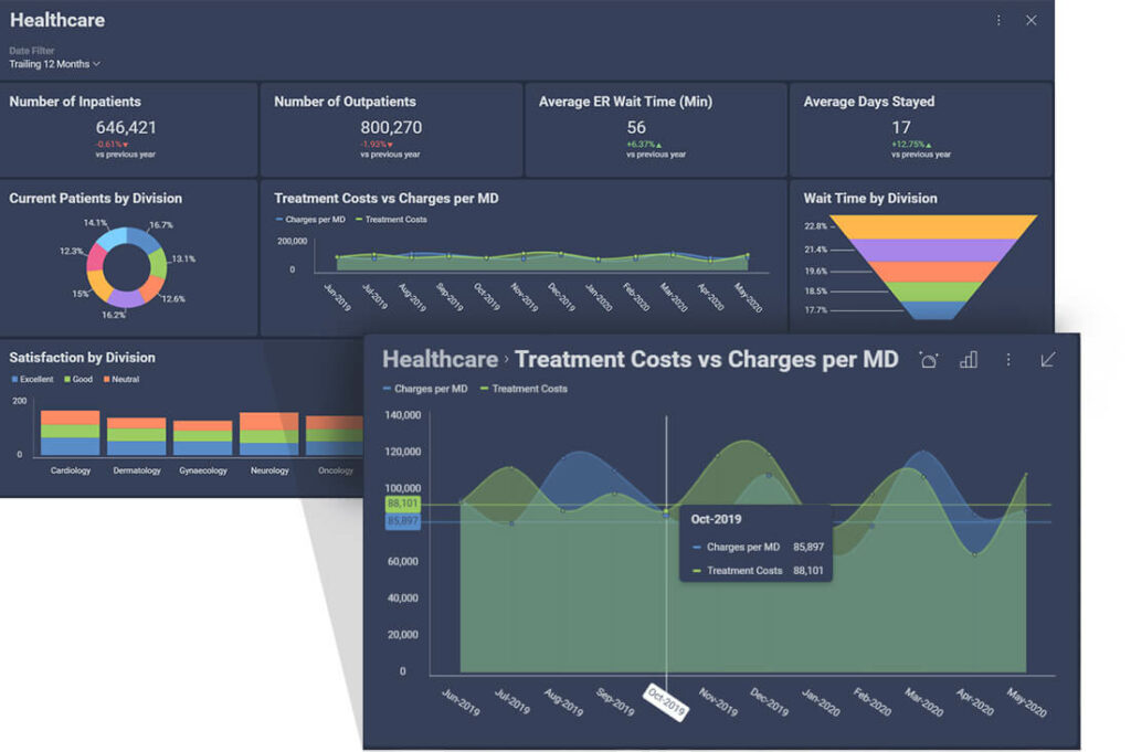
Dashboards are an organizational answer to the infographic. Dashboards, which can typically be customized to fit the needs of various companies, departments, or teams, deliver important business intelligence reporting to the computer and mobile screens of managers and other decision-makers. Often, the data displayed in charts and graphs on a dashboard is real-time or at least very recent, which lets people keep an eye on processes throughout the day. Unlike infographics, which are usually static, dashboards may come with some built-in data analysis tools. They may allow the user to tap or click to delve more deeply into metrics or see different views of the same data visualization story.

In a business setting, data visualization usually includes a wide variety of charts and graphs. These are embedded into dashboards and other process software, displayed on monitors or bulletin boards in common areas, or inserted into presentations for the boardroom. Some examples of the types of visuals common in data analytics and visualization are summarized below.
Charts and Graphs
Charts and graphs are typically the first tools considered when discussing data visualization storytelling. A line chart can tell the overall story of data trends over time faster than a narrative or numbers, and a bar chart can let the viewer quickly compare counts or performance among different categories. But lines and bars aren’t the only graphical tools in the data analytics and BI reporting toolbox. Here are some other charts and graphs that are used in data visualization:
- Box-and-whisker plots are a great way to quickly see whether there are outliers dragging a process up or down. They’re also valuable when comparing averages, standard deviations, and means of a process — analysis factors that are helpful when answering questions such as “Are these two processes statistically the same?”
- Gantt charts provide a quick visualization of projects or processes across time. They’re a great way to determine whether a complex schedule is realistic as planned, discover where one process may run into or overlap with another, and make predictions about (or see when) processes are running behind.
- Scatter or dot plots use dots to visually indicate every data point being considered. These let you see potential trends, outliers, and groupings. For example, if you’re tracking employee efficiency by day, each employee might be represented by different colored dots. That makes it easy to see if one employee is performing significantly above or below the pack. The plots also let you see if some other element, such as the day of the week, impacts overall performance.
- Histograms show the distribution of your data. Histograms are statistical tools that help in drawing probability conclusions. But as a visualization storytelling tool, they can quickly demonstrate whether a process is hovering around the right mean or whether outliers are skewing results for data or outcomes.
- Pie charts are a quick way to illustrate what factors are at play in a process. Various versions of pie charts are good if you need to see whether each part of the whole is pulling its weight or you want to see what factors are most important in a process or outcome.
- Control charts are specific types of line or dot charts that track the changes in a process over time. These statistical process control tools can provide information quickly about whether a process is “in control” or not. Control charts are often parts of analysis dashboards because they can be used to determine if a process is working as designed or if some manual intervention may be required to make an improvement or correct an issue.
- Treemap charts are data visualization tools that show hierarchical data using nested nodes (rectangles) of varying sizes and colors, making it easy to spot data patterns or to compare data quantities. The treemap chart visualizations should be used in specific scenarios. They don’t solve the same problem that a visualization like a bar chart or a line chart would but are instead meant for more complex, richer data display.
Tables
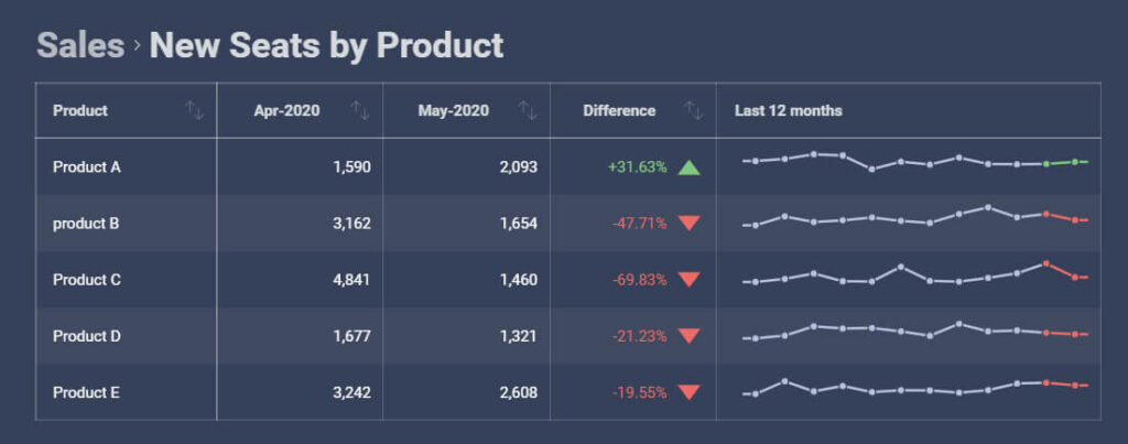
Pictures may be worth a thousand words, but sometimes charts and graphs don’t quite do the job on their own when it comes to data storytelling. When you want to accompany your visuals with a more specific look at the data behind them, tables are typically the best way to display that information. That’s partly because everyone knows how to read tables’ column and row structures.
You might include tables in your data visualization reports when you know stakeholders will want to see more granular information. You can also include them if you want to specifically point out how one piece of data is skewing the conclusions that might be drawn from a chart.
When data analytics are embedded into software, they often come with options for viewing tables. For example, if someone can see a bar chart on their dashboard, they may be able to click on it to see the table and data behind it. This can be helpful if the bar chart seems concerning and the manager of the process would like additional information before acting.

Maps
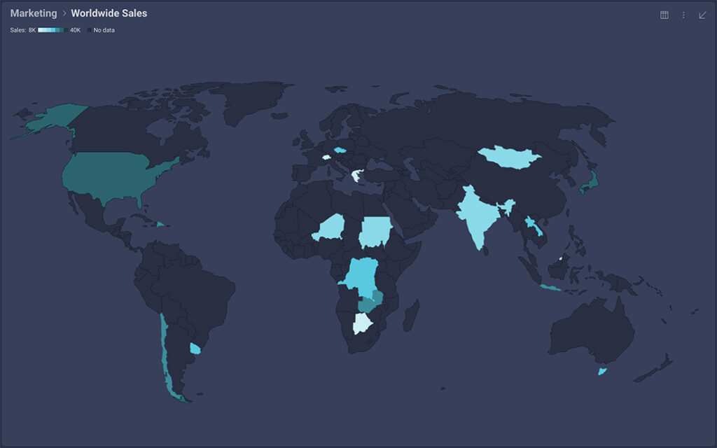
Maps are an ideal way to display data that are linked to location. Which states do you ship to most? Which neighborhoods have the oldest houses and thus might need certain types of services? Where in your facility are temperatures the coolest? These are all questions that might be best answered with map data.

Data visualization benefits
Data visualization comes with plenty of benefits. Not only that it can transform raw data into actionable insights that anyone can understand, but it could also speed up the decision-making process, identify patterns and trends, and ultimately boost your revenue.
Here are our top benefits of data visualization:
It lets us absorb large amounts of data at a glimpse of an eye
The human brain is programmed to think visually. It can process visuals 60,000 times faster than text. Moreover, our brains can effectively process an image in just about 13 milliseconds. Think of how powerful it is to see a graph, chart, or other visual representation of data. It is way easier for the brain to process the data that way instead of if you’re looking at a spreadsheet with rows of numbers.
It speeds up the decision-making process
When your brain can process the data from a visual representation so fast, that means that you can also make a data-driven decision faster. According to the Wharton School of Business, data visualization can increase the ability to reach consensus quickly and move towards action by 21%.
It easily shows relationships between operations and results
Finding a correlation between business operations and market performance is vital in the competitive space, so that’s why one of the main benefits of data visualization is that it allows users to track the connection between both and act accordingly whenever necessary.
It can boost your revenue
Data visualization is all about finding the right information to help decision-makers make the right business decisions. With the help of real-time data visuals, you and your team will have the ability to perform advanced predictive analytics for different aspects of your business. For instance, you’ll have access to up-to-date sales data that can help determine marketing strategies or product popularity among target customers.
Data visualization best practices
Understand the user first – The first thing that we want to do when creating a data visualization is to understand the user first, the person who is going to analyze your data story. Here are a few questions that you can ask yourself or your users to help you get started:
- Who will be using the visualization?
- Who is my audience? Who am I trying to reach with my data story?
- What questions should this visualization answer?
- Do I need one visualization or more?
- Is this an exploratory visualization or an explanatory visualization?
Use the right chart type – Before you decide what chart type to use, ask yourself: What data story are you trying to tell with your visualization – do you want to compare data or show data distribution? Are you doing trend analysis or something else? After you have the answer to that question, you’ll easily choose the chart type that will best tell your data story.
Proper use of color & text – Colors speak to us louder than words and communicate with us on an emotional level. We may not realize it most of the time, but on a subconscious level, every color triggers a different emotion in people. 62 – 90% of a first impression is based on how someone is recognizing color in the situation. So, the challenge here is to use the power of color effectively to communicate the message you want to send.
Avoid chart junk – Edward Tufte, the father of data visualization, says, ‘’Above all else show the data’’. Don’t confuse your audience by adding unnecessary information or graphics such as background imagery, heavy grid lines, shading, etc. Always remember that the simplest way is usually the best way to show your data.
Be clear with your data – Use available visualization features to ensure clarity in your data story.
- Sorting alphabetically helps people find what they are looking for.
- Sorting ascending helps tell the story of growth.
- Sorting descending helps compare largest to smallest.
- Descriptive and concise titles give a reason for the chart.
- Trend lines clarify time series data sets.
- Value overlays give details while analyzing.
Highlight what’s important – Focus people on what’s important about the story that you’re trying to tell.
- Series highlighting focuses the user on what they should look at.
- Conditional formatting brings attention to key data points with diverging color palettes.
- Annotations can support storytelling, either on a chart or with collaboration.
- Outlier detection shows data ranges in or out of expected values.
- Time series forecasting is an expected capability.
- Linear regression plots trends between dependent and independent variables.
Use effective interactions – Using effective interactions is also part of the data visualization best practices. Some of the things that users must have the ability to do include filtering data and linking dashboards and visualizations to others to give users deeper insights and drill down into the comprehensive analysis.
Use 3D wisely – 3D visualizations have a place if you are doing surface analysis, volatility analysis, or doing terrain research. Avoid 3D for standard business use.
Use the right level of detail – Don’t use excessive details that don’t contribute to the data story.
Use the right scale – Avoid changing the scale of the Y-Axis, as this tends to tell a different story than the data should.
Data visualization example in action
Data visualization can’t always stand alone
It’s important to realize that, as powerful as data visualization is, it’s not the only data analytics tool your company should be using (consider an analytics tool such as a self-service embedded analytics software). Visual representations of data can’t always stand alone, which is why so many business intelligence reporting tools and dashboard options let you drill down into deeper levels of the information.
A prime example of when data visualization doesn’t stand well alone is when you’re trying to determine if something has a correlation. You can use a correlation chart, which plots two sets of data points in different colors. If the dots from both data sets hover along the same line, it can indicate a relationship. But there are some pretty hefty statistics at work behind this, and the visual doesn’t always give you enough detail to make a call on whether the two sets of data are statistically related. Plus, if you publish the visual alone, without any narrative explanation, there’s a chance that people unfamiliar with statistics will assume that cause and effect are at play. But correlation does not necessarily mean causation.
Ultimately, visual data storytelling makes it easy for people throughout your organization to understand data more clearly. But you still probably need the right analytics experts or tools to steer the ship when it comes to complex data analysis and presentations.


