Embedded Charts
What Is an Embedded Chart?
In general, a chart is a visual representation of data. Charts allow businesses to see the results of their actions and strategies to better understand what is working and what isn’t in order to effectively predict future events and plan accordingly.
With that said, an embedded chart is a chart that has been embedded directly in the context of the user’s workflow, typically as a part of analytics or embedded analytics software package.
What Are Embedded Charts Used for?
Again, charts, embedded or not, showcase business data and KPIs to help users and decision-makers to get a better picture and guide smarter decision-making. Here are some particular ways in which embedded charts are extremely helpful:
- Help users to better understand complex information quickly (for example, when people view dashboards to conduct an overall process health check).
- Allow users to easily identify trends and patterns in data (for example, whether sales are going down, whether the first Friday of the month always has a spiked call volume, etc.).
- Allow users to identify relationships in data (for example, whether the night production process flounders whenever a certain person is in charge).
- Allow users to identify a frequency in data (for example, how often a product is purchased in a specific geographical area).
- Help users to examine a network and better understand customers’ behavior (for example, which audiences marketers should target with their message).
- Help users analyze risk, address issues before they occur, and become a real business problem.
- Supports data-driven storytelling by helping users communicate a story that gets the message across your organization.
These are just a couple of examples of what embedded charts could be used for but there are many more use cases for them depending on the industry and business itself, as well as what business questions users want to answer.
What Are the Elements of an Embedded Chart?
A single chart includes many elements in it – some of these elements are displayed by default, while others can be added on the go and only if needed. A good analytics solution will allow users to also be able to customize charts, change chart elements, move them around, resize them, or remove chart elements that users don’t want to display.
These are the key elements included in an embedded chart:
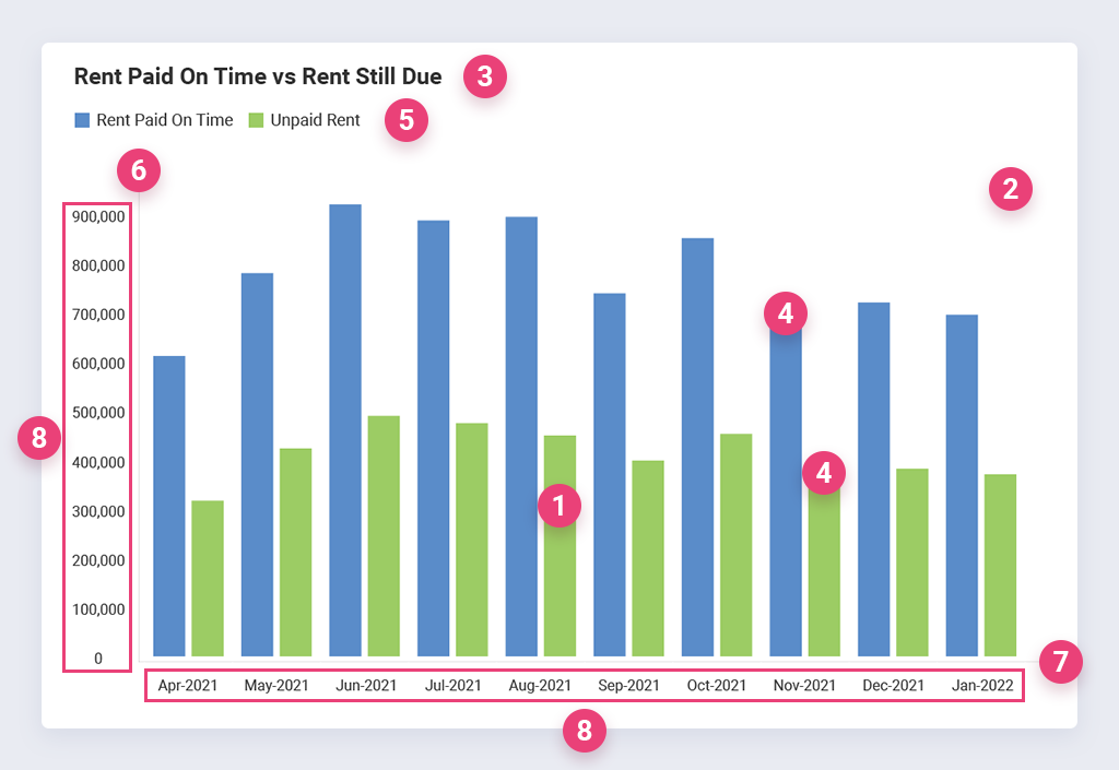
- Chart area – this is more or less self-explanatory; it is typically the dashboard area occupied by the chart.
- Plot area – the area on the chart that displays the data in the chosen chart type.
- Title – a text box informing chart viewers what the chart is about (e.g. First Quarter Sales).
- Data point – a single part of data appearing on the chart. For most chart types, each data point shows the value of the contents of one cell in the data range linked to the chart.
- Data series – sets of related data. One chart can have one or more data series, and each type displays these data series differently. Most of the time, data series correspond to rows of data in the data range.
- The Y axis – also called the value axis- is vertical (except for bar charts where it is horizontal), displaying the values in data.
- The X axis – also called the category axis, the X axis is a horizontal (except for bar charts where it is vertical) display of category names.
- Axis labels – words or numbers that mark the different portions of the axis. For the value axis, labels are computed based on the data displayed in the chart, while for the category axis, labels are taken from the category headings entered in the chart’s data range.
- Axis titles – words or phrases that describe the entire axis.
- Categories – containers into which the data from each series is sorted.
- Legend – shows what kind of data is represented in the chart.
Of course, other elements could be included in an embedded chart, but these are some of the most common ones.

Common Embedded Chart Types
There are infinite chart types to choose from, and each has unique attributes that can help you best get your message or data story across depending on multiple factors. For example, a line chart can tell the overall story of data trends over time faster than a narrative or numbers, and a bar chart can let the viewer quickly compare counts or performance among different categories.
However, these are the essential embedded chart types that you’ll see most frequently offered by visualization and analytics tools:
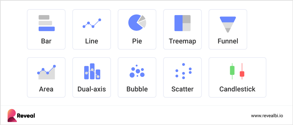
Bar chart – or sometimes used as a column chart- provides a way of showing data values represented as vertical bars with heights and lengths proportional to the values they represent. Some bar graphs present bars clustered in groups of more than one, showing the values of more than one measured variable. The bars can be plotted vertically or horizontally.
Line chart – displays information as a series of data points called ‘markers’ connected by straight line segments. It is often used to show trend data or the comparison of two data sets.
Gantt chart – provides a quick visualization of projects or processes across time. Embedded Gantt charts are a great way to discover where one process may run into or overlap with another and make predictions about (or see when) processes are running behind.
Pie chart – this embedded chart type provides a quick way to illustrate what factors are at play in a certain process. Various versions of pie charts are good if you need to see whether each part of the whole is pulling its weight or if you want to see what factors are most important in a process or outcome.
Treemap chart – shows hierarchical data using nested nodes (rectangles) of varying size and color, making it easy to spot data patterns or compare data quantities. The treemap chart type doesn’t solve the same problem that a chart type such as a bar chart or a line chart would but is instead meant for a more complex, richer data display.

Control chart – these are specific types of line or dot charts that track the changes in a process over time. These statistical process control tools can provide information quickly about whether a process is “in control” or not. Control charts are often parts of analysis dashboards because they can be used to determine if a process is working as designed or if some manual intervention may be required to make an improvement or correct an issue.
Area chart – has the same foundation as the line chart type, but it also adds in a concept from the bar chart type with shading between the line and a baseline. The embedded area chart is often used to show both how a total has changed over time and how its components’ contributions have changed.
Dual-axis chart – overlays two different charts with a shared horizontal axis, but potentially different vertical axis scales. It is often used to directly compare the two sets of vertical values, while also including the context of the horizontal-axis variable.
Bubble chart – a cross between a scatter plot and a proportional area chart, the embedded bubble chart type displays three dimensions of data or in other words, it showcases the relationship between three variables. Too many bubbles can make the chart hard to read, so it has a limited data size capacity. This can be somewhat remedied by interactivity: clicking or hovering over bubbles to display hidden information and having an option to reorganize or filter out grouped categories.
Funnel chart – demonstrates the flow of users through a business or sales funnel – how many users make it to each stage of the tracked process from the width of the funnel at each stage division.
Scatter and dot plots – both of these embedded chart types use dots to provide a visual indication of every data point being considered. They allow viewers to spot potential trends, outliers, and groupings. For example, if you’re tracking employee efficiency by day, each employee might be represented by different colored dots. That makes it easy to see if one employee is performing significantly above or below the pack. The plots also let you see if some other element, such as the day of the week, impacts overall performance.
Box-and-whisker plots – are helpful when answering questions such as “Are these two processes statistically the same?” by allowing viewers to quickly see whether there are outliers dragging a process up or down. They’re also valuable when comparing averages, standard deviations, and means of a process.
Histograms – Histograms are statistical tools that help in drawing probability conclusions by showing the distribution of your data.
How to Choose the Right Chart Type?
Theoretically, your data could potentially work with multiple types of charts. However, it is up to you as the dashboard designer to make sure you are selecting the chart type that makes the data clear and concise for your audience – the people who are going to view it.
When choosing a chart type, think of these key questions:
- What is the key point you want to communicate with your chart?
- Do you want to compare variables?
- Do you need to understand the distribution of the data?
- Are there possible trends you need to analyze for?
Choose the point you want to make and select a chart type that is optimal.
How to Choose an Embedded Chart Solution?
First of all, we recommend going for a full-package embedded analytics solution, rather than a standalone embedded chart solution. Every embedded analytics software offers a variety of chart types for users to choose from in order to visualize their data. But it also goes far beyond data visualization tools. A good embedded analytics solution provides users with self-service and white-label capabilities, and a set of advanced and predictive analytics functions such as forecasting, machine learning, and more.
Of course, every solution on the market varies in terms of its features and functionalities, its integration and connectivity requirements, and of course, price. So, depending on your business needs, these are some of the key things you should look for when choosing a tool for your data analytics purposes.
If you cannot connect all your data to the tool, then how are you going to visualize it? Make sure that the analytics tool you choose to invest in offers a wide range of data sources to connect to your data, so your users can easily and quickly create real-time, high-impact dashboards.
Nowadays, having important business insights at your fingertips is a necessity. With this in mind, don’t forget to look for mobile BI capabilities that allow users to leverage the power of analytics and data visualization on the go. That way, users can access valuable business insights on their smartphones at any time and act at the moment of impact.


